
Soviet Kodak Moments
The wild history of color film in Russian cinema

Did you know that some of the most acclaimed Soviet films of all time were shot on American film stock?
No, really.
Nowadays filmmakers with accrued clout spring for IMAX cameras, but if you were a successful Soviet director in the 60s-80s, you begged on your hands and knees to shoot Kodak. It sounds crazy, even blasphemous to suggest that filmmakers preferred photo stock from Rochester, NY to their government’s default color stock—but it’s true…and the history behind it is even crazier.
It was 1945 and World War II was ending. While advancing across the Eastern Front, the Soviets captured a new type of film from the Nazis—Agfacolor. It had been used for still photography and feature filmmaking by the German public over the past decade. This wasn’t a bulky Technicolor system with three rolls of black & white, it was a single strip of color film.
“The negative consists of three emulsion layers, sensitive to blue, green, and red light, respectively. Each layer contains elements capable of producing—through chromogenic development—a dye complementary to the color to which that specific layer is sensitized (namely, yellow, magenta, and cyan). The resulting negative thus displays colors complementary to those of the original subject. Once printed onto a positive film stock featuring this same structural composition, the result is an image that accurately reproduces the colors of the subject.” -Photographer Gert Koshofer
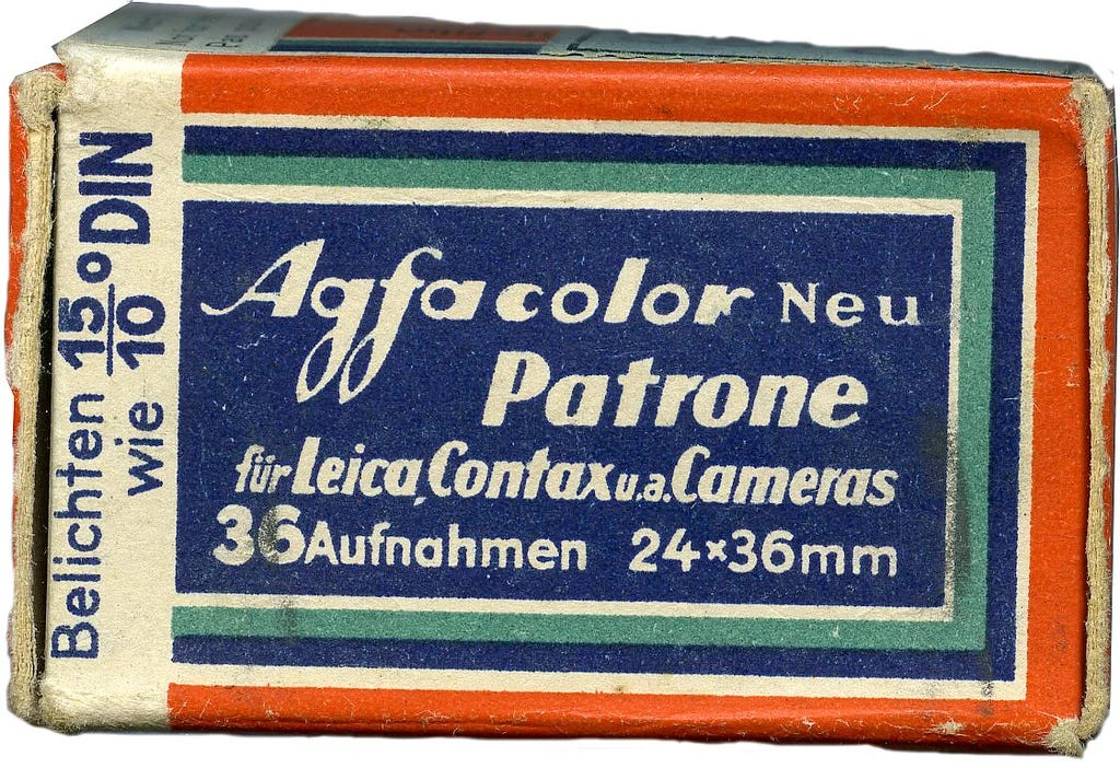
This stock was sort of the photochemical pioneer of it’s day. Believe it or not, Agfa film can still be bought in photography shops today. That’s right, we can throw it in with the likes of Fanta and Volkswagen—everyday products with a cursed Nazi origin. When facilities that made and processed Agfacolor fell, they were taken over by different Allied nations. Some tinkered with the chemistry of the color stock while the Soviets immediately sent rolls back east for ongoing film productions.
Port of Freedom (1945) and Ivan the Terrible Part II (1946)
What immediately stuck out with Agfacolor was its pastel color scheme. The stock wasn’t as saturated as Technicolor, and skin tones had a sepia appearance. Contrast was light, almost milky. The film had an ASA of 25, meaning it was on the slower side and required more light for proper exposure. Today, that number seems low (the slowest motion picture stock you can shoot is rated at 50) but back in the day it was an improvement. For comparison, Technicolor films were shot at 2-3 ASA with floodlights that burned (!!!) the actors and sets. So why all this talk of Agfacolor and its aesthetic? Well, after the war Mosfilm began filming in a new process called Sovcolor which was noted as being similar to Agfacolor. How similar? You be the judge:
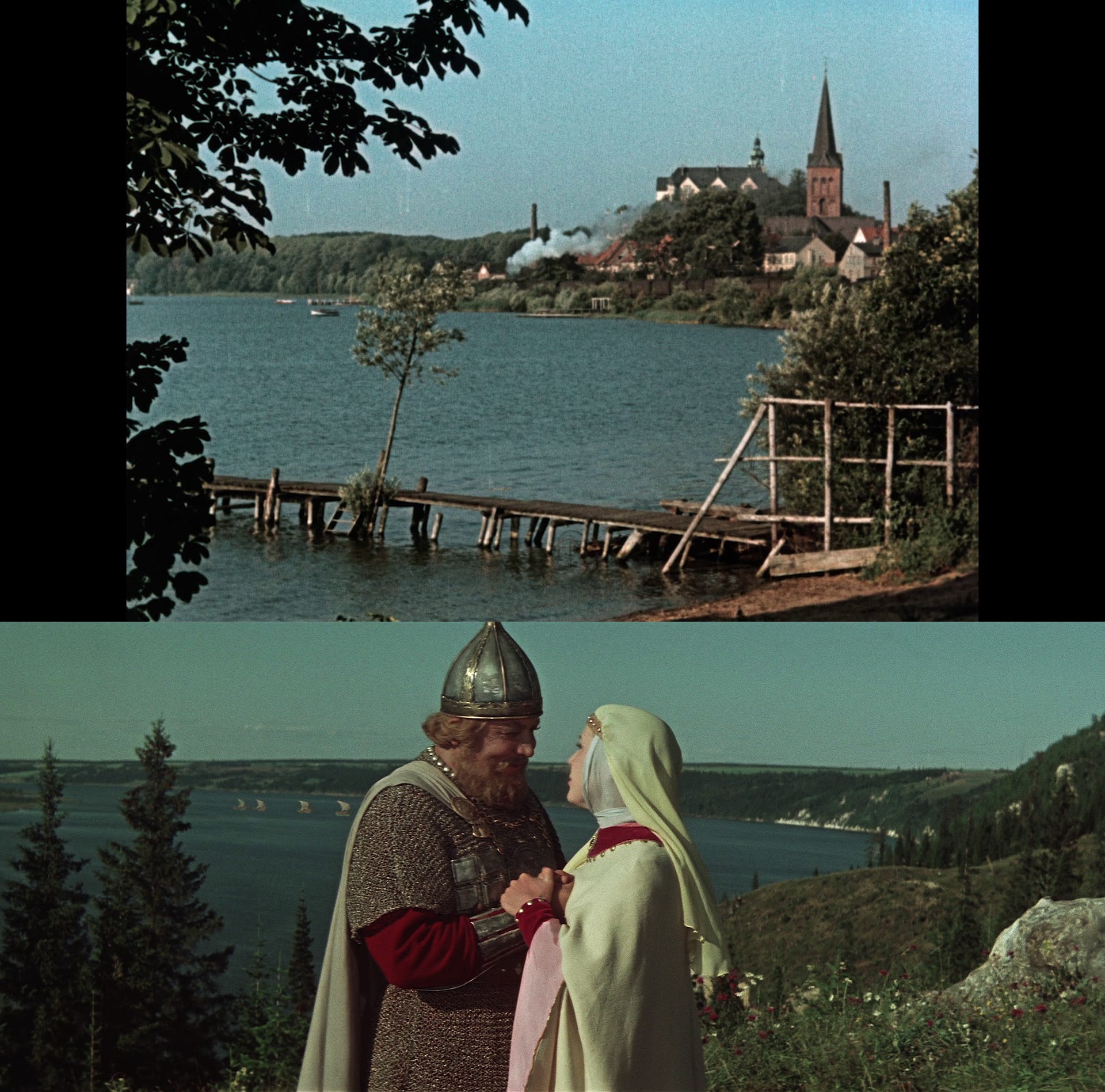
Top: Immensee (1943) Bottom: Ilya Muromets (1956)
That’s right, early runs of Sovcolor were just Agfacolor by a different name! The Soviet color films of the 50s certainly had a unique aesthetic, but when viewed side-by-side with their German counterparts it was clear the same film stock was being used.
“Prints produced at the Sovexport copying facility in East Berlin were initially screened in cinemas under the name Sovcolor. In 1946, the Russians launched their own raw film production in Shostka (Ukraine), utilizing Agfa equipment.” -Gert Koshofer
Author Adrian Cornwell-Clyne saw one of these films in a British theater and reported back:
“The writer heard innumerable people express very strongly their view that the colour was to be prefered to that of Technicolor. The expert saw that there was anomalous colour rendering due to the very defective magenta coupler, but here and there shots turned up of very exquisitely satisfying colour.”
On the other side of the Atlantic, the Americans were also studying Agfacolor. The R&D guys in Rochester came up with their own stock: Eastmancolor. It quickly became the standard for color films in English.
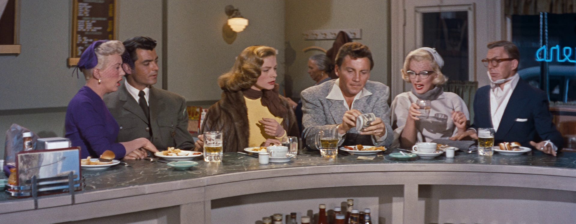
How to Marry a Millionaire (1953). Note the similar pastel color scheme
The scientists and artists at Kodak gradually improved Eastmancolor over the next two decades until most of the bugs that had plagued Agfacolor were smoothed out. The Soviets, on the other hand, made minimal changes to their chemistry. The stock was now sold as Svema Color Film. Its hues were more distinct and the contrast healthier, but still had noticeable issues which we will get into later. In the 60s, many Soviet filmmakers bypassed these troubles by shooting more stable black & white stocks. The productions that wanted color, however, were caught in a bind.
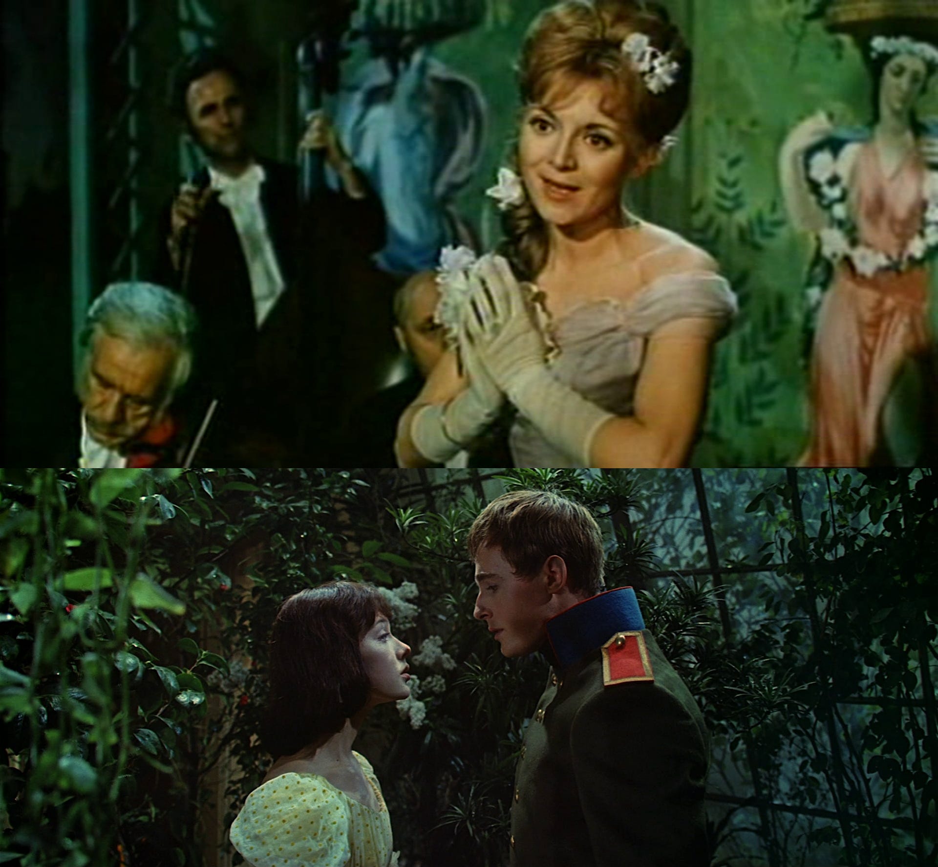
Nights of Farewell (Top) and War and Peace (Bottom)
After much deliberation, Goskino USSR (State Committee for Cinematography) started buying small batches of Kodak film. It would become a prized resource in the nationalized film industry, available to artists who ideologically jived with the folks in charge. The irony (not lost on these officials) was that Goskino had been created to curtail foreign imports. By design, Kodak would have to be a scarce resource. High profile projects like the epic War and Peace (1965-67) and Soviet/French co-production Nights of Farewell (1965) shot select scenes on 65mm Eastmancolor film.
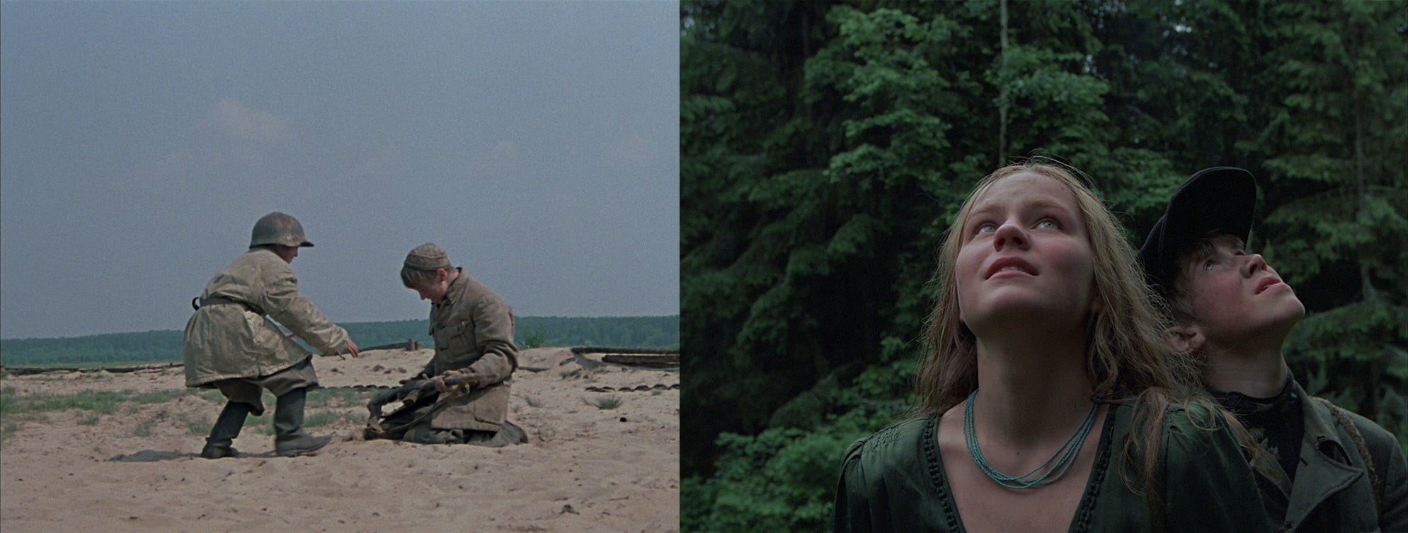
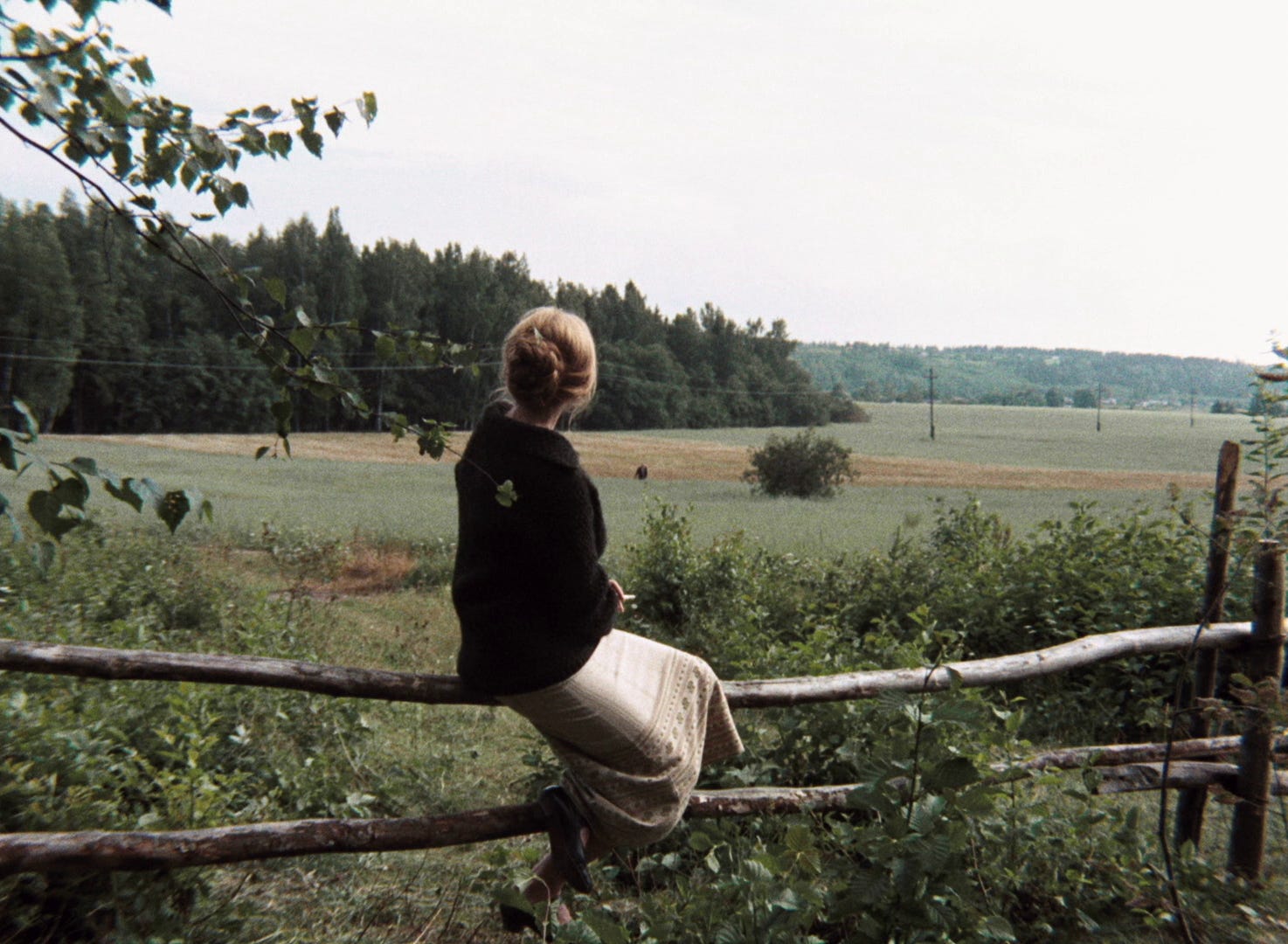
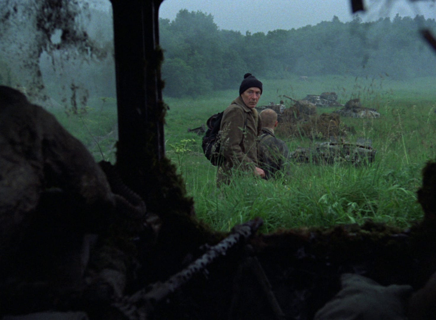
Come and See (1985)
When reserves ran out, the filmmakers went back to Svema color stock. Director Elem Klimov decided to shoot all of Come and See in color—regardless of stock type. Small sections were shot on Svema while the majority was done on Kodak. The differences are obvious if you know where to look. Note Svema’s pastel trees/sky (left) compared to the deep emerald green of Kodak (right). Aesthetically, it was an imperfect compromise. Most directors knew this, especially one auteur who devised a different solution…
Solaris (1972)
Andrei Tarkovsky was on a wobbly roll in the early 70s. Ivan’s Childhood had been the darling of the Venice Film Festival but Andrei Rublev had a delayed release after an arduous editing process under the censors. Tarkovsky set his sights on adapting Stanisław Lem’s 1961 novel Solaris, and had enough clout with Goskino to shoot certain sequences on Kodak film. The specific stock was Eastman Color Negative 5254. If you’ve ever seen Jaws, The Exorcist, or The Godfather then you’ve seen a film shot on 5254. The most visible differences are warmer skin tones, healthy contrast, and deeper colors. Look at the above shot from Solaris and notice how the pastel look is absent.
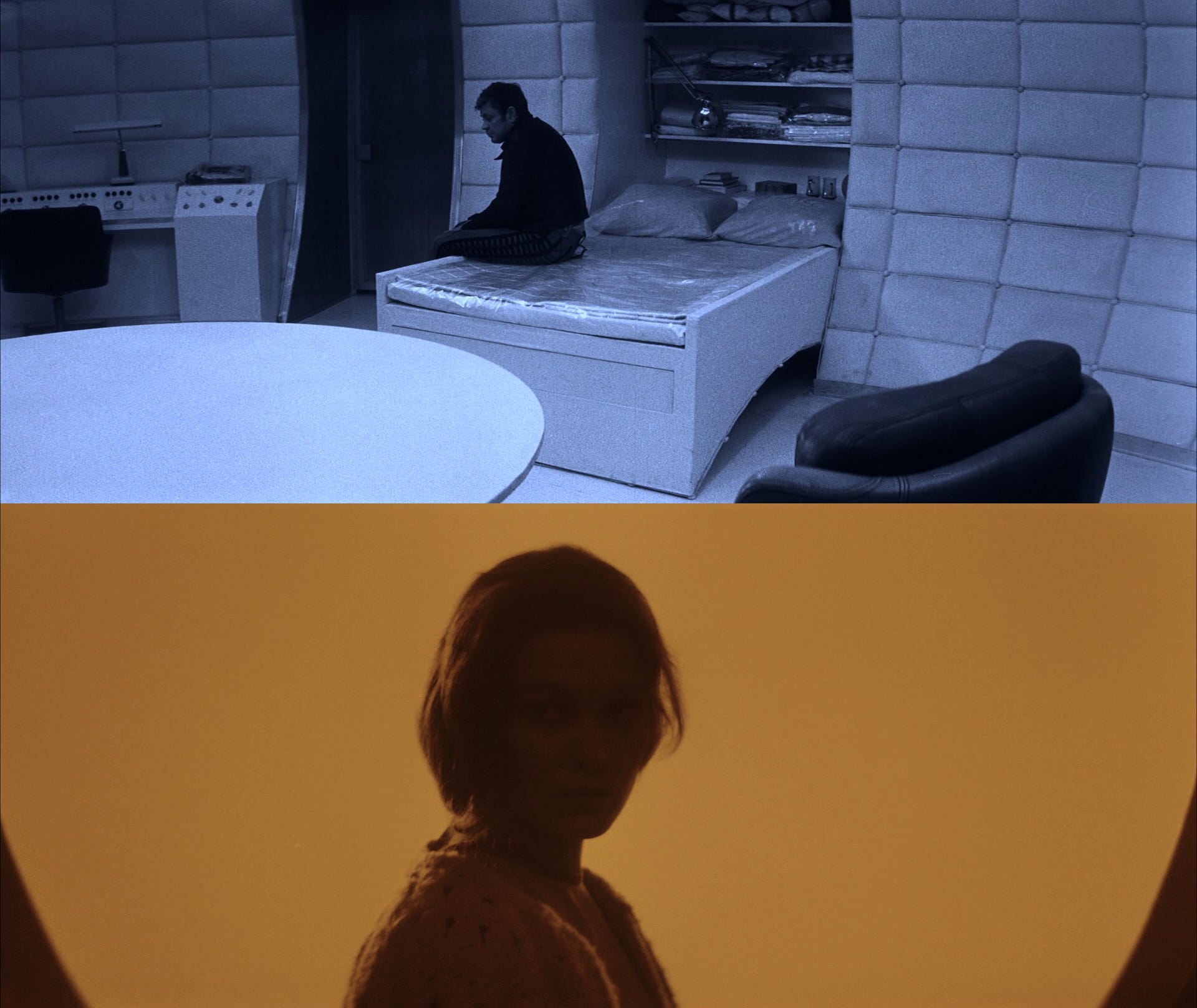
Tinted/toned shots from Solaris
Ever wonder why some scenes in Solaris are monochromatic? That’s because the production’s stash of Eastman film had run out! Instead of mixing Sovcolor with Kodak, Tarkovsky decided to tint and tone black & white footage as it gave similar contrast values.
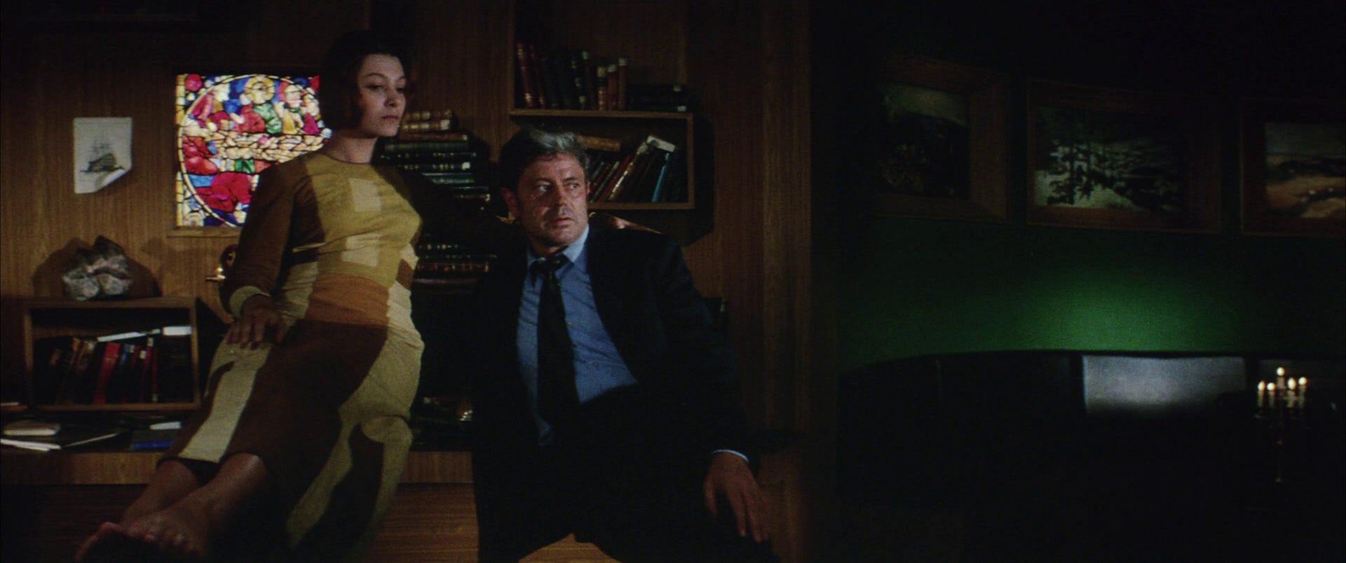
Stalker (1979)
It wasn’t so much that Kodak film looked better than Svema. It was that the stock was more reliable. Svema color stock was prone to manufacturing issues and could screw up an entire day’s shoot if it was defective. Color fluctuations were still an issue and created continuity problems in editing—and that was if the stock passed QC! Cinematographer Yusuf Aslanyurek (taught by two of Tarkovsky’s DPs) explains:
“My teachers V. Yusov and Kalashnikov told us they didn’t like the stock because it occasionally had trouble (like missing color layer). As they said, Kodak gave a guarantee even in that time(!) Kalashnikov said ‘There was no big difference with color rendering between Kodak and Russian film stocks. Kodak was better because I always got the results I wanted’.”
But film stock is still film stock and sometimes accidents happen. For the production of Stalker, Tarkovsky and DP Georgy Rerberg chose to shoot with the newer Eastman 100T 5247. The results were, to say the least, catastrophic.
“Tarkovsky was certain the film was swapped. This newer Kodak which Gambarov sent specifically for Stalker was stolen and in some way or another ended up in the hands of a certain very well-known Soviet film director who was Tarkovsky’s adversary. And they gave Andrei a regular Kodak except that nobody knew about this and that’s why they processed it differently. Tarkovsky considered it a result of scheming by his enemies. But I think it was just the usual Russian sloppiness.” -Sound Designer Vladimir Sharun
Every roll of Eastmancolor film shot for the production came back misdeveloped. The footage was baked in a deep green tint. None of it was usable. Some theorized that Soviet laboratories didn’t know how to develop the newer 5247. Tarkovsky suspected sabotage, and parted ways with Rerberg when the decision was made to reshoot the entire film from scratch. What followed would seal the fate of many cast/crew members.
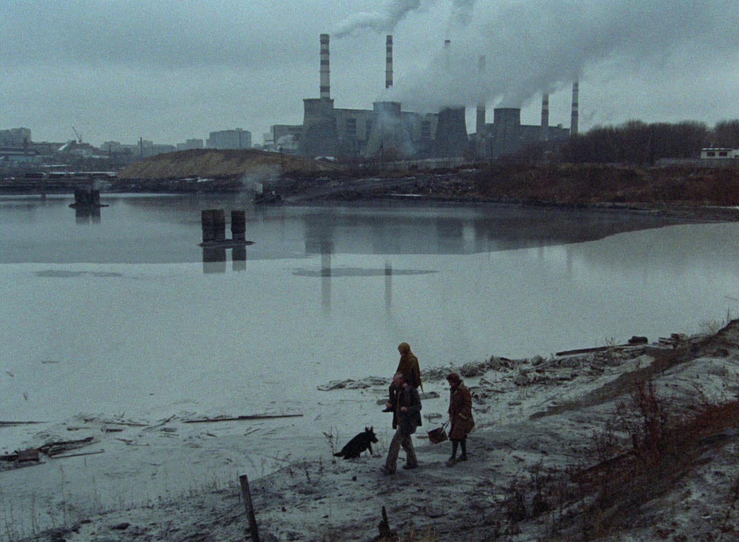
“We were shooting near Tallinn in the area around the small river Jägala with a half-functioning hydroelectric station. Up the river was a chemical plant and it poured out poisonous liquids downstream. There is even this shot in Stalker: snow falling in the summer and white foam floating down the river. In fact it was some horrible poison. Many women in our crew got allergic reactions on their faces. Tarkovsky died from cancer of the right bronchial tube. And Tolya Solonitsyn too. That it was all connected to the location shooting for Stalker became clear to me when Larisa Tarkovskaya died from the same illness in Paris”
-Vladimir Sharun
After the Soviet Union dissolved, Svema’s reign was dethroned by an influx of foreign color stocks. The pastel look that had been so prevalent in cinemas faded throughout the 1990s as Kodak and Fuji became the norm. The film stock so many directors had fought and died over was now just another product on store shelves.
Saw this wonderful piece on my timeline on twitter and as a film nerd I had to read this and sign in to subscribe your newsletter